
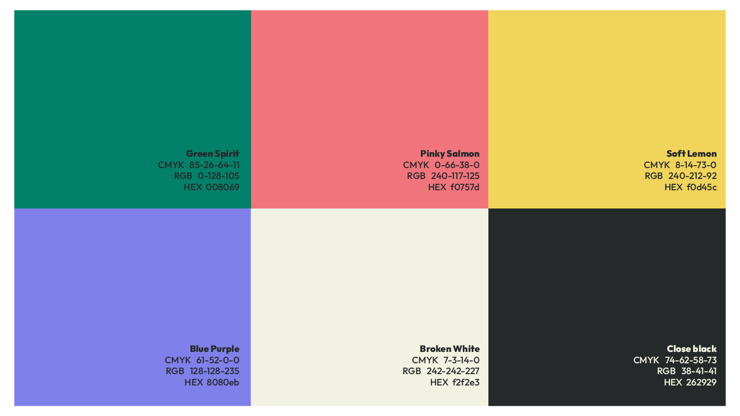
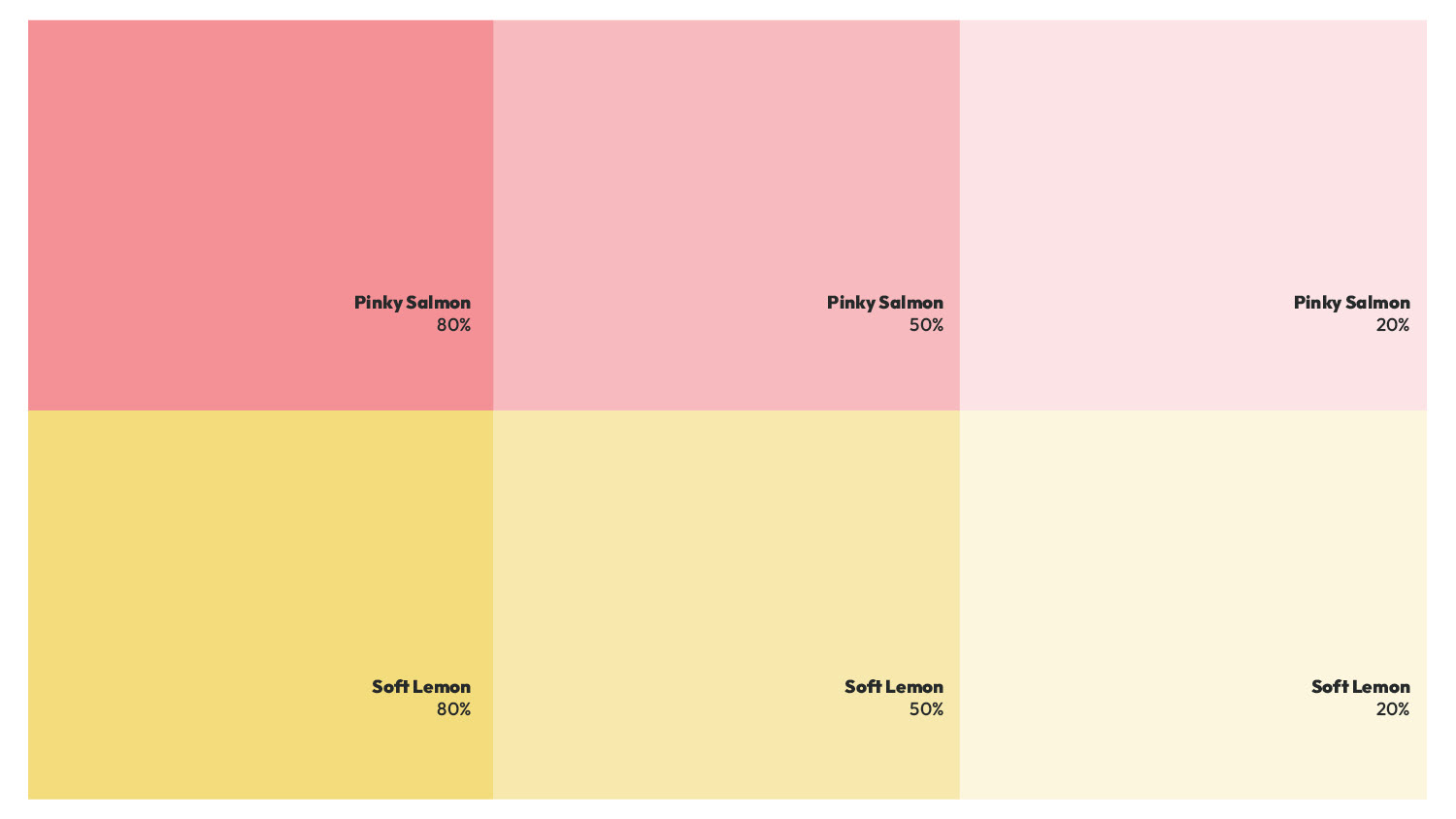
Color palette and typography chosen for the logo, along with illustrations for social media posts and the website — creating brand unity.

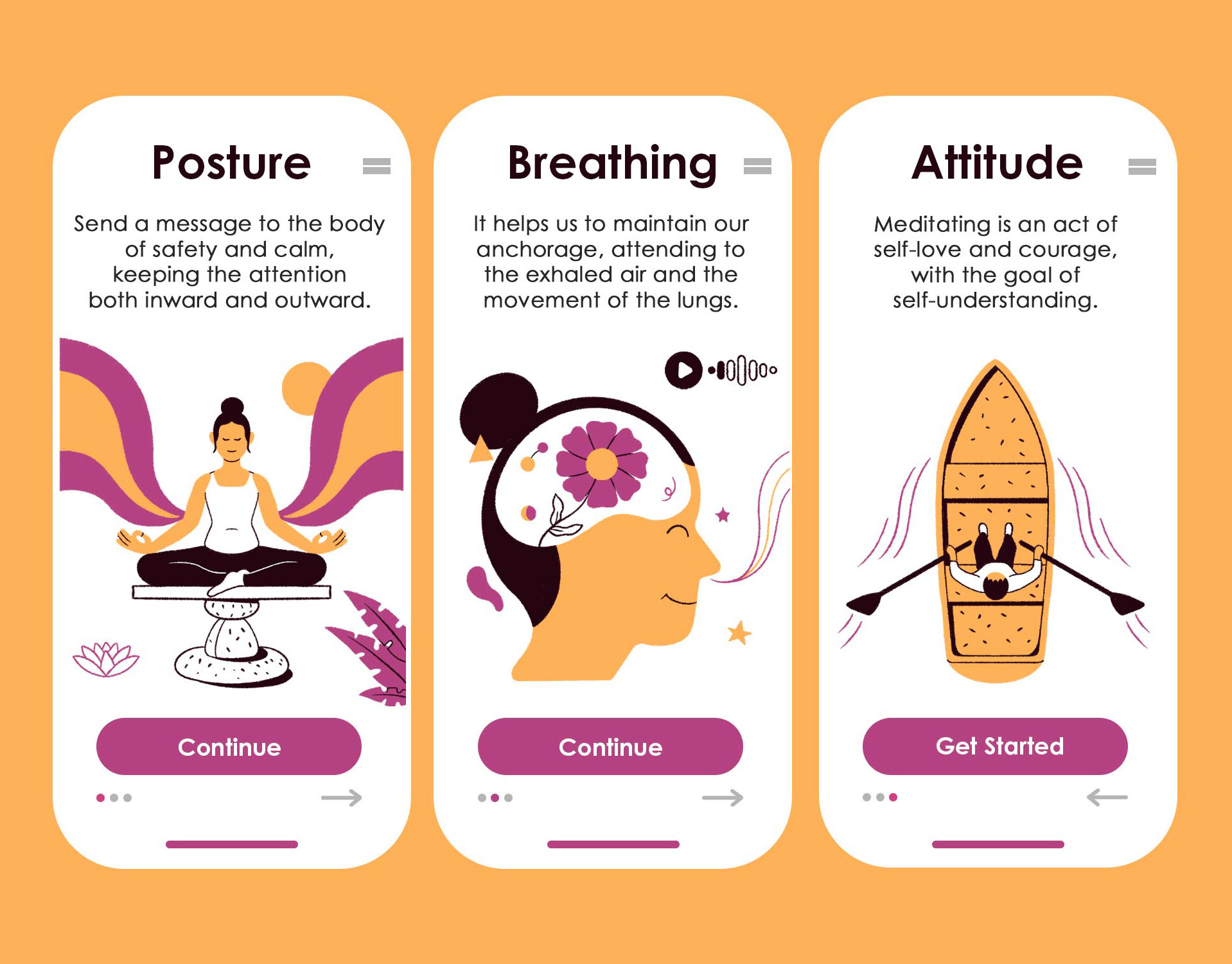
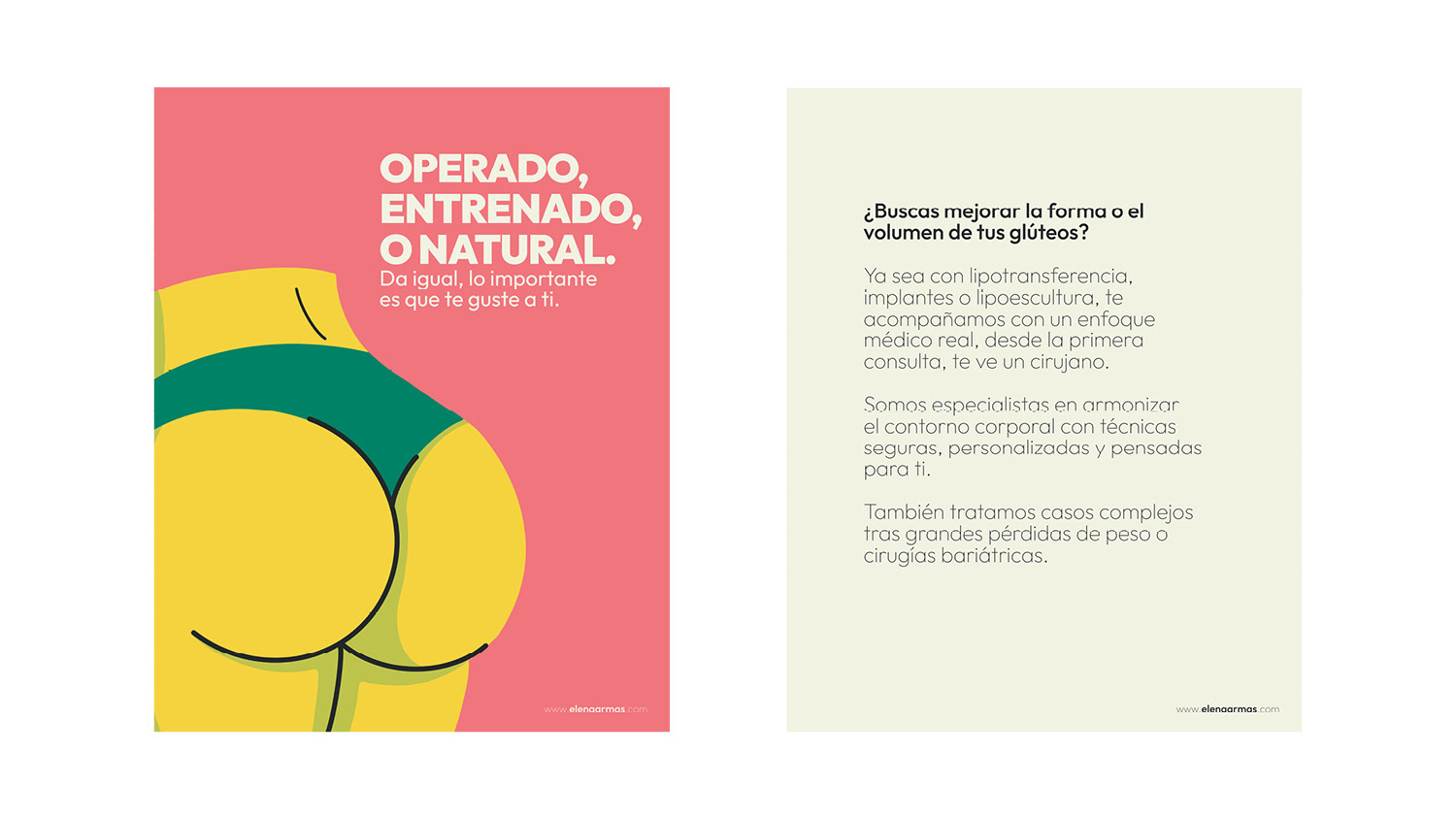
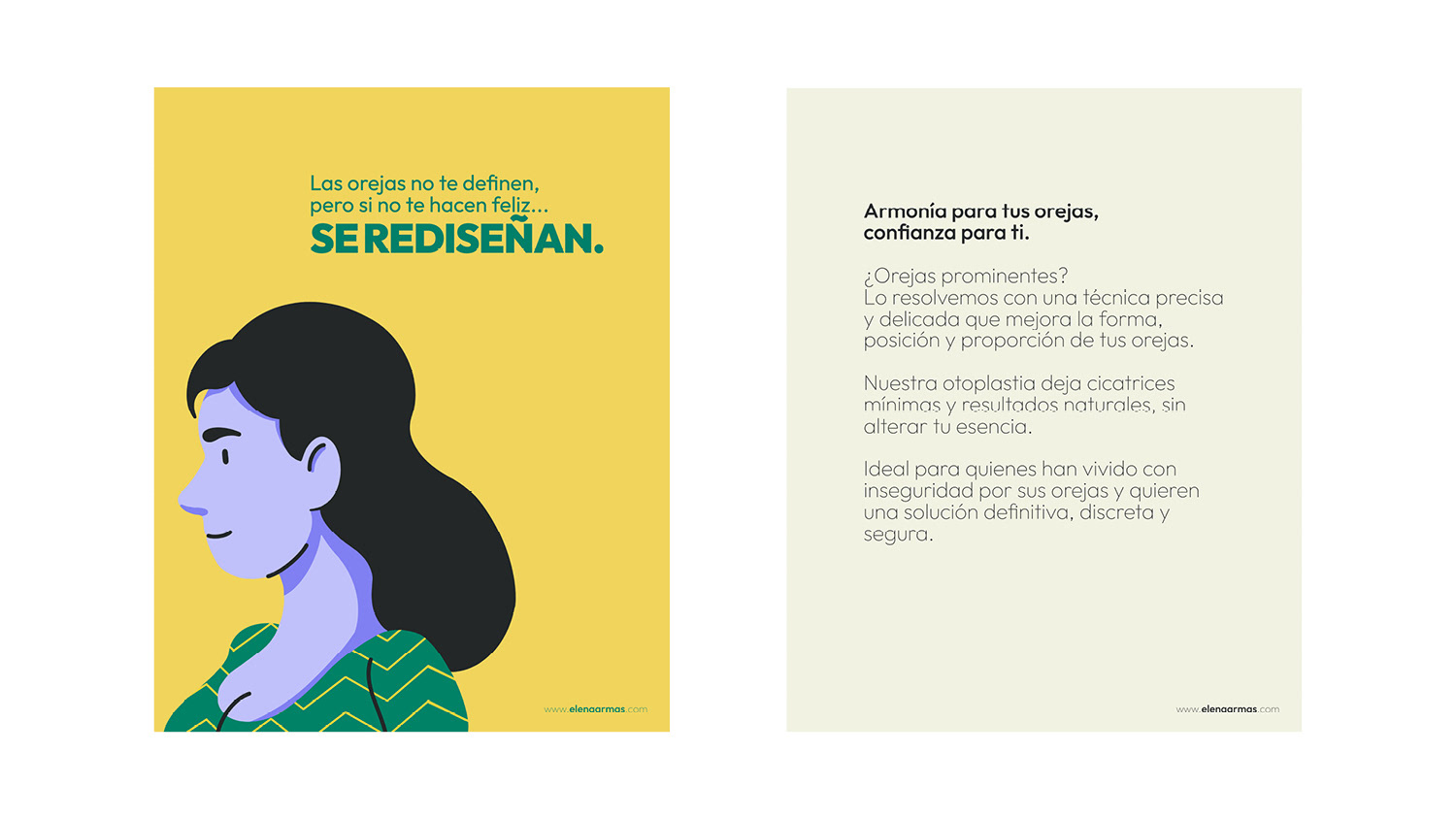
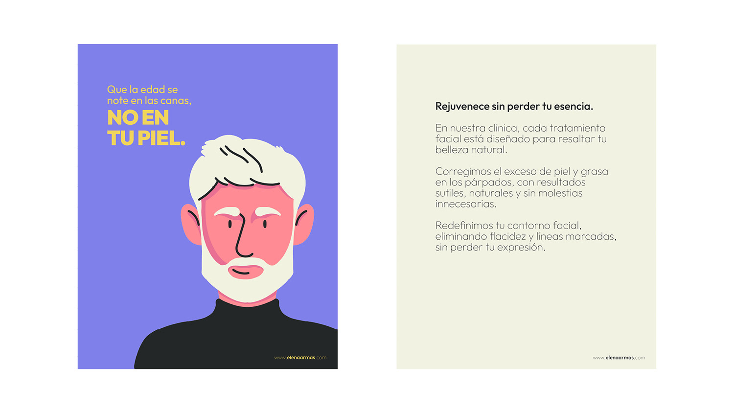
Some of the illustrations with our color palete applied to them.


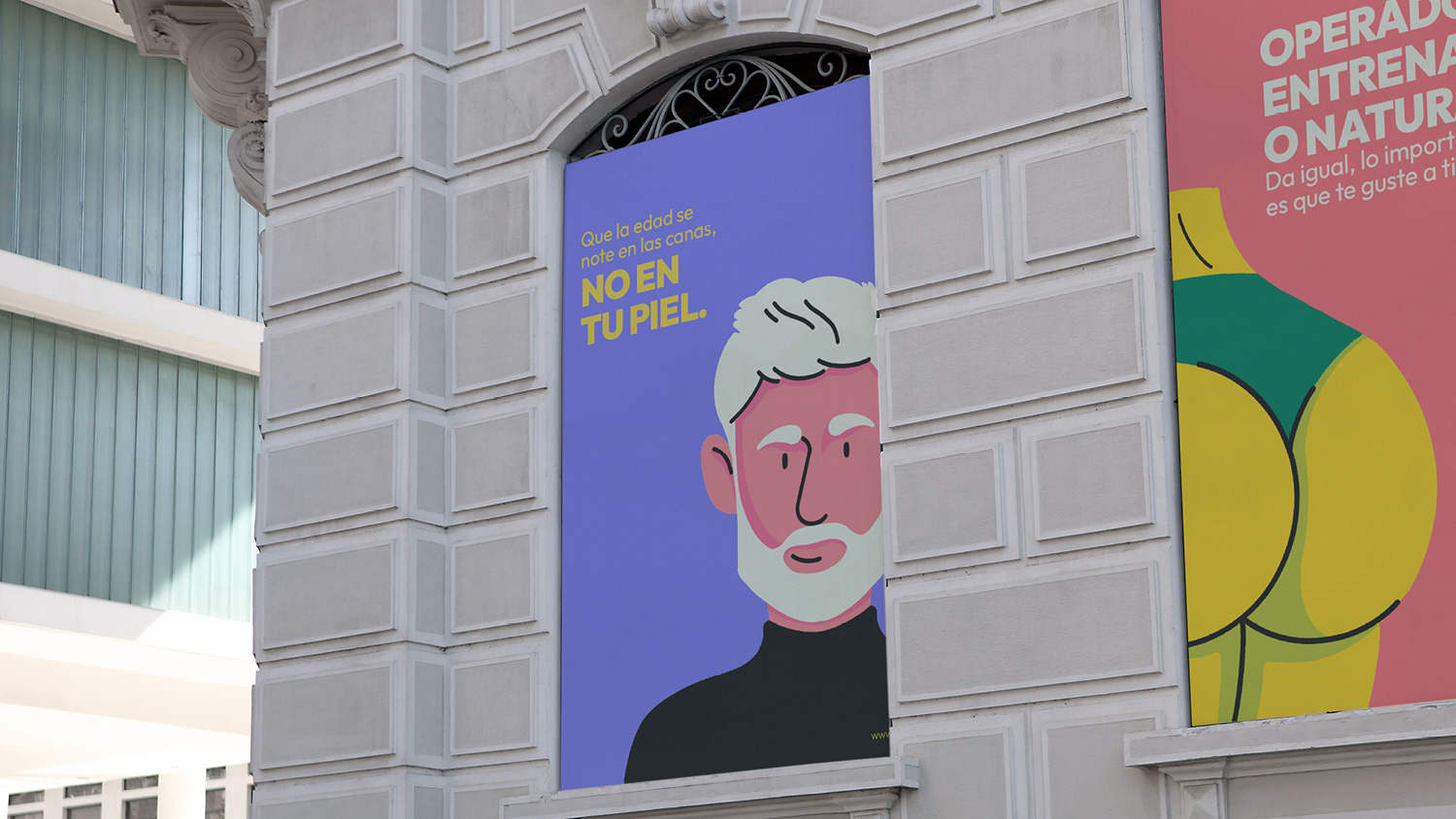
Some mock ups to show how the social media posts will looks like, also some street advertising.

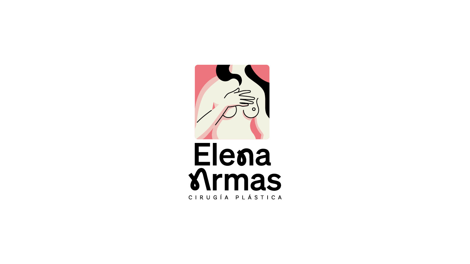
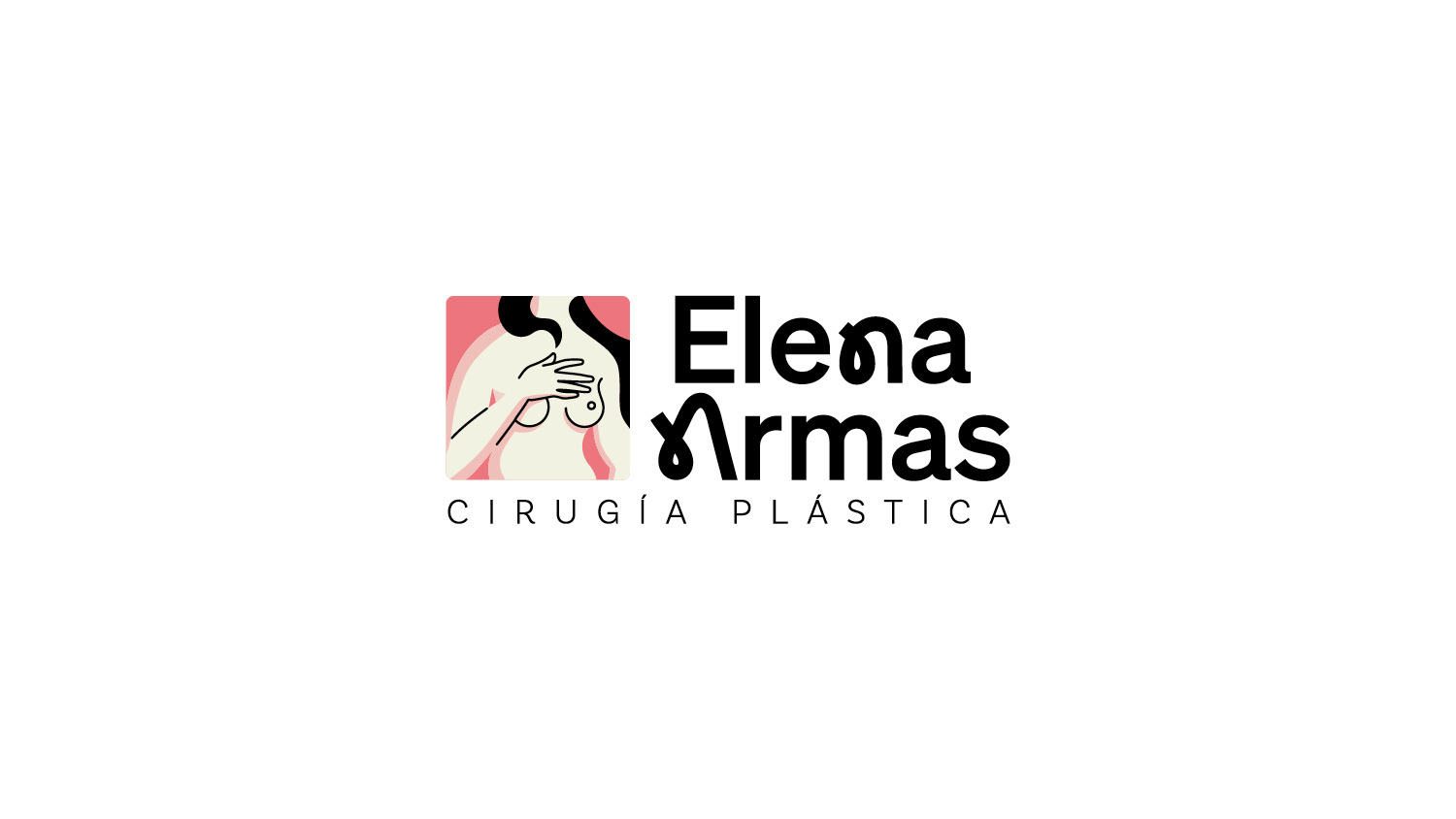
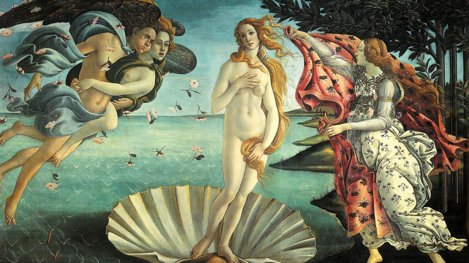
Brand identity developed under the direction of Superreal for plastic surgeon Elena Armas. Inspired by classical representations of beauty, the project combines minimalist vector illustrations with a vibrant and unconventional color palette to create a fresh, contemporary healthcare identity that stands apart from more traditional medical branding.
Client: Elena Armas Branding